
Add graphics on your dashboards
Now that you have created your dashboard, you can add graphics on it.
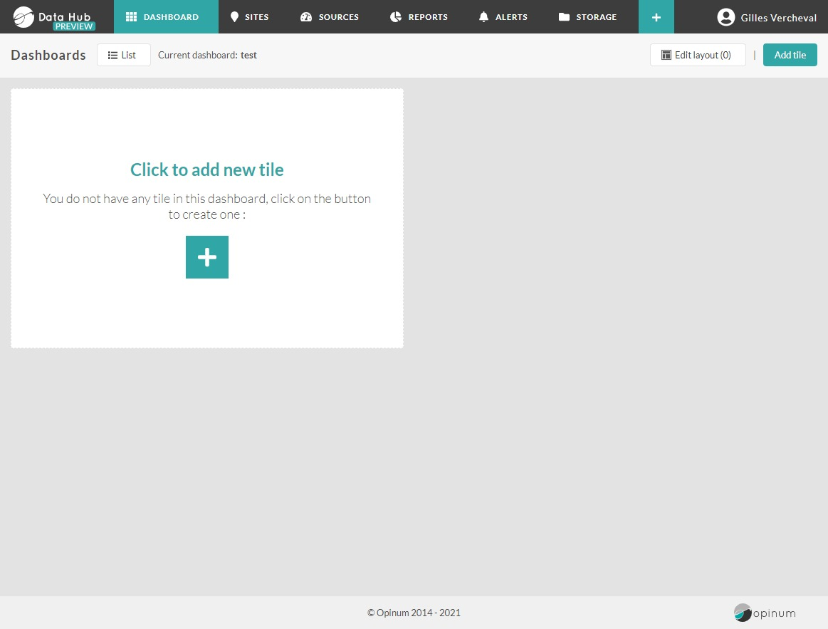
Click on the symbol + which appears as soon as you move your mouse on the image representing a graph.The Graphics pop-up will open.
Choose a name
The name of your graphic will be displayed in its header. It does not need to be unique and can be edited later.
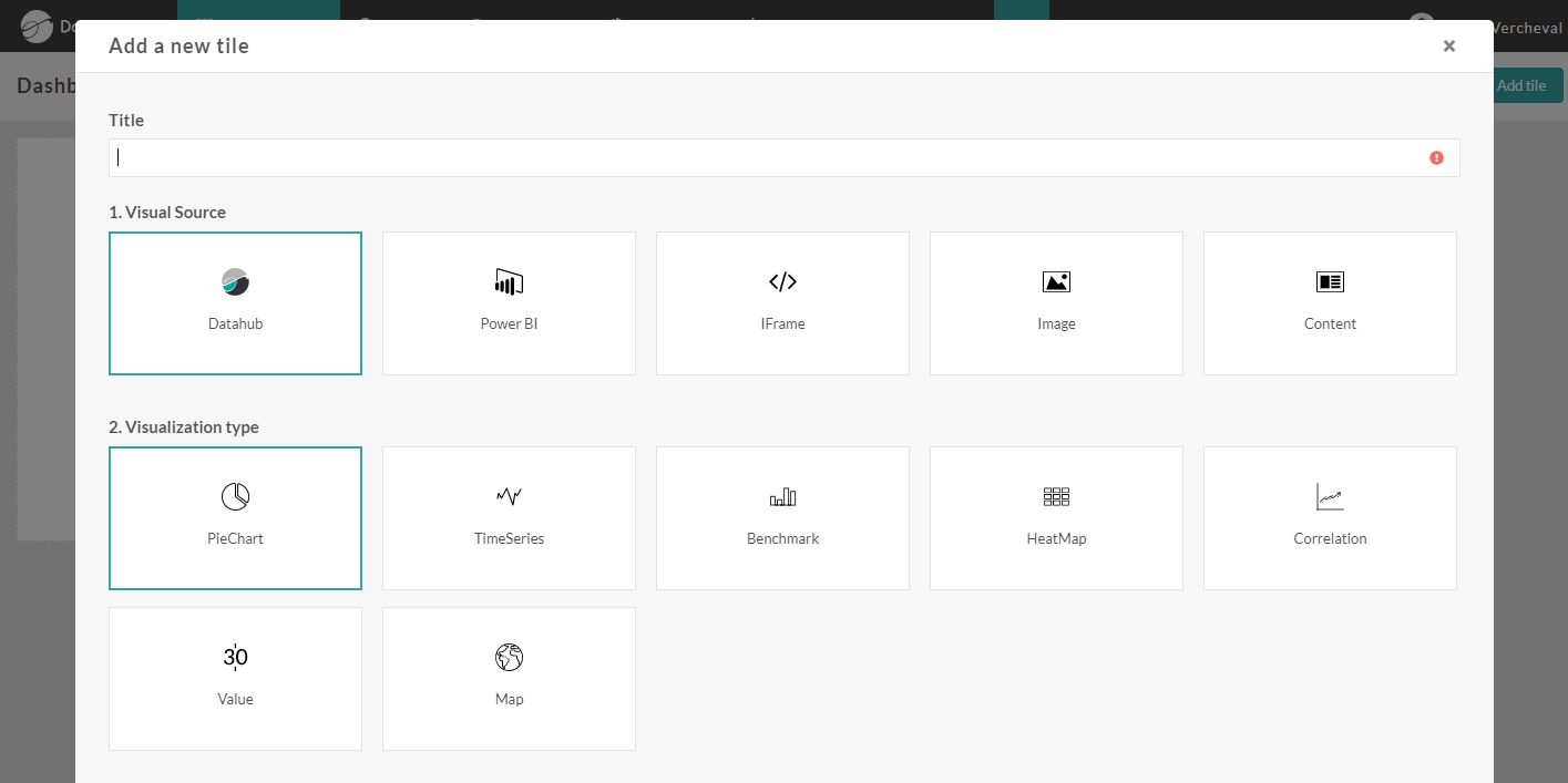
Choose source type
Select the visual sources of the graphics:
- Points: create graphics based on the data of your sources managed in Opinum Data Hub.
- Alarms: create graphics based on alarms managed in Opinum Data Hub.
- GPS coordinates: create graphics based on GPS coordinates of sites.
- Power BI: display your Power BI graphics directly in your Opinum dashboard. To do so yo should first link your Power BI account to Opinum. This can be done at account level or at a user level.
- Internet page: display an internet page as an iframe in your dashboard. To display the internet page as full page, display it in full page size.
- Image: display any image from your storage or your computer to illustrate your dashboard.
- Text: display text
Points
To create a graph based on Opinum data, select the Points visual source.
Types of graphics
Choose the type of graphics you want to create:
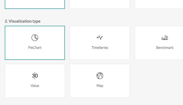
- Pie chart: graph showing a relative comparison
- Time series: graph showing data points via dots on a timeline
- Benchmark: graph showing a comparison based on absolute values
- Heatmap: graph showing a timeline in hours (24H) combined with two dimensions (vertical axes): dates and intensity of heat.
- Value: graphic showing a single value or two values compared
- Correlation: graphic showing scatter plots and regression line
- Map: graphic showing a marker on a map for sites.
Time frame
There are two types of time frame you can define :
Absolute : You define a precise date range by selecting it through the date picker.
Relative : allows you to select a defined period that evolves over the time.Three options are available :
Past : Only complete past periods will be shown. For example, when selecting 'Relative - Past - 1 month' the 21 august 2017, data from the month of July 2017 (01-07 to 31-07) will be shown.
Past and current : complete past period will be shown AND the period until the current day and hour. For example, when selecting 'Relative - Past & current - 1 day' the 21-08-2017 16:00:00, data from the 20-08-2017 00:00 to 21-08-2017 16:00 will be shown.
Current : only the current period will be shown. For example, when selecting 'Relative - Current - this year' the 21-08-2017 16:00:00, data from the 01-01-2017 00:00 to 21-08-2017 16:00 will be shown.
Tip
If you want to display a previous period which evolves over the time and which is not available in the relative time frames, you need to use the shift functionality.
Data
In this section, you can define the data sources that you want to visualize in the graph you are creating. You can chose single sources or group of sources, called views. In both case the following fields should be filled:
- Site: building in which the source is located (physically or virtual). It's replaced by the View name when the graphic is based on a view.
- Source: source to be visualized. For view based graphic you can select all the sources of the view or a top.
- Variable : variable, linked to the selected source, you want to visualize
Note
If a default variable is defined on the source, the fields variable and unit will be pre-filled with it. Learn how to select a default variable.
- Unit : unit of the selected variable
Tip
Learn more about sources views
Axis: primary axis is the vertical and main axis. This axis is showed on the left of the graph. One axis can only show values with a same unit. If the data, which one is willing to combine with the data related to the primary axis, contains values with different units, one should indicate "secondary axis". Secondary axis are unlimited and shown next to each other.
Shift: this functionality allows you to define an offset to the time frame originally selected. That's particularly valuable when you wish to compare same data at different times. Learn more about shift here
Color : change the colour of the data
Click on the Save button to see the new graph in the dashboard
The data in the graph will be visualized in the order in which one has selected the data. It is possible to change the order by "drag and drop".
Alarms
To create a graph based on Opinum alarms, select the Alarms visual source. Those graphs allow to visualize alarms current status or occurences, without adding any variables. The graph are directly connected to the alarms data base.
Tip
Learn averything about Alarms tiles
GPS coordinates
To create a graph based on sites GPS coordinates, select the GPS coordinates visual source. Those graphs allow to visualize sites on a map directly based on their localisation.
No need to select time frames or variables. Sites can be added one by one, by sites views or sources views.
Power BI
To display your Power BI graphics directly in your Opinum dashboard yo should first link your Power BI account to Opinum. This can be done at account level or at a user level.
Tip
Learn more about [Power BI connection to Opinum] (xref:external-services#link-external-services)
In the add dashboard pop-up, select the Power BI icon.
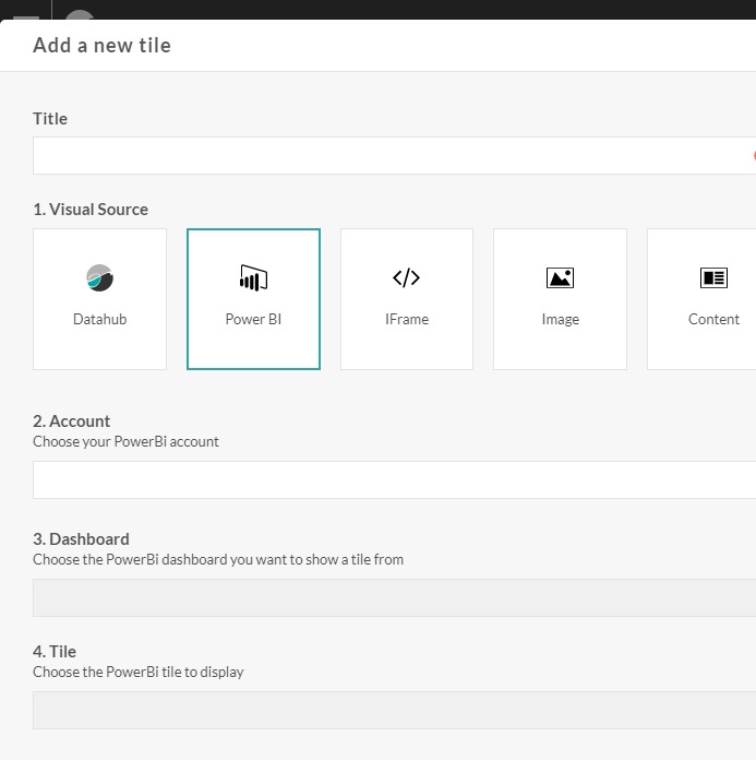
Then, click on the Login to Power BI account link. A login pop-up of Power BI will opens. Login and save. The dashboards of your PowerBI account will be displayed in the Dashboards drop-down, pick the one that contains the tile you want to display. The tiles of the Power BI dashboard will be displayed in the Tiles drop-down. Pick-the one you want to display in your Opinum dashboard and click on the Save button. Your Power BI graphic is now added to your dashboard
Internet page
To display an internet page in the tile, select the url icon.
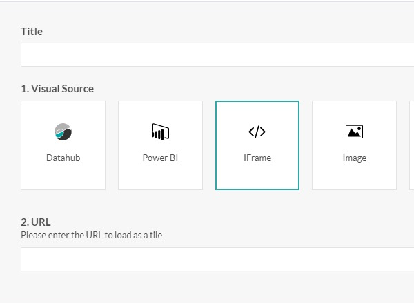
Enter the url of the internet page you want to display and click on the Save button. Your graphic is now added to your dashboard.
To display an internet page as full page, display it in full page size.
Note
If the graph is empty, it's maybe because the website does not accept to be embedded.
Image
To display an image in the tile, select the Image icon.
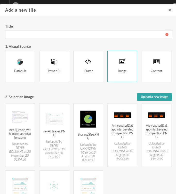
The images already stored into your Storage are displayed. To upload a new image, click on the Upload a file button. The Upload file pop-up will open. Drag & drop your image in the pop-up, or click on the browse link to find it n your computer. Enter a name for the image and click on the Upload a file button. The image is uploaded in your Storage.
Click on the image you want to display in your tile and click on the Save button. Your image is now be added in your dashboard.
Text
Perfect to give context and information about the data displayed in the dashboard, this graph enables you to publish text. A wysiwyg editor helps you to format the text with standard text editing features. To display a text in the tile, select the text icon.
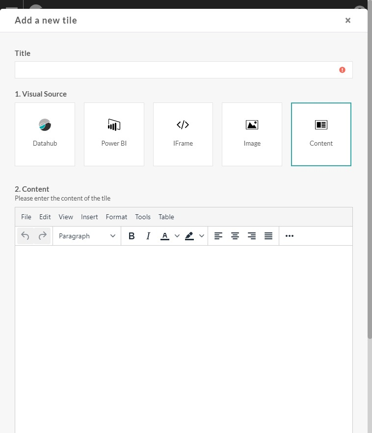
Type your text, format it and click on the Save button. Your text will be added in your dashboard.
Click on the Add a new graph button to add a second graph in the dashboard.