
Opisense 4.20
This release introduces a new data connector, Siemens and new features for dashboards.
Release date: 26 Septembre 2019
Improvements
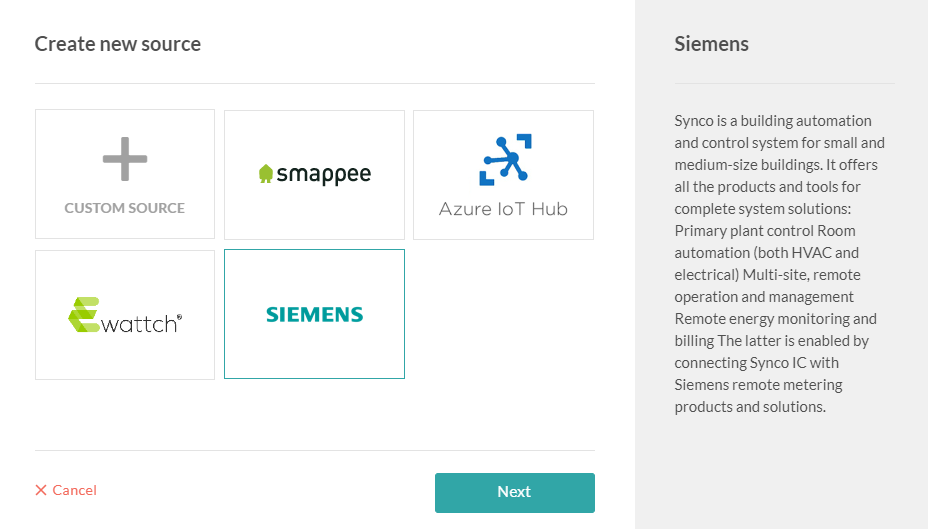
New connector: Siemens
It's now possible to connect directly your Siemens sources into Data Hub directly from the Sources pop-up.
Tip
Learn more about Siemens
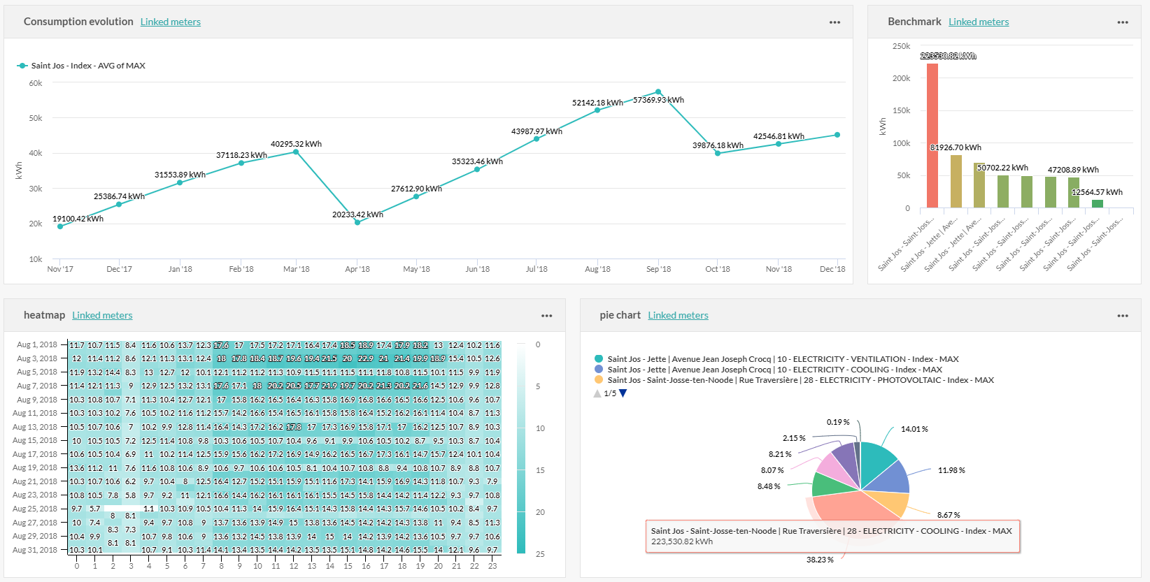
New dashboards features
Live zoom in timeseries
Now you can click on any timeseries to display the granularity below. The zoom is only displayed in the user interface, the graphic is not edited. To reset the graphic to the initial granularity just click on the Reset zoom button.
This is a new feature by default on all timeseries, you don't need to modify your charts to enjoy it.
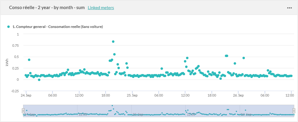
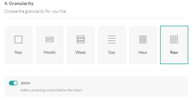
Zoom in raw data
When a timeserie is displayed in raw data, you can now choose to display it with a bar zoom, just like the Data quality tab in the pop-up source.
In the Dashboard edition pop-up, select the raw granularity and check the switch Zoom on.
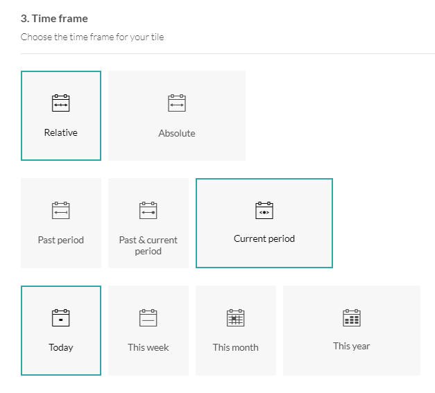
Display current value
The current period can now be selected: today, this week, this month or this year. The data will be updated automatically.
Copy / paste a tile from a dashboard to another
To copy and paste a graph from a dashboard to another, just click on the Paste to a dashboard button, go on the other dashboard and click on the paste button. The graphic will be paste at the bottom of the dashboard.
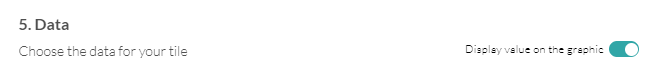
Display values on graphics
Values can be now displayed on graphics. On pie charts you can choose to display values or percentages.
In the Dashboard edition pop-up, in the Data section, switch on Display value on graphic.
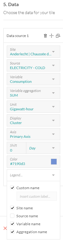
Customize legends
Legends can now be customized for each data sources. You can choose to display a customized legend, site, source, variable and aggregation names.
Change color of value tile
The color of the value graph can now be changed just like in the other graphics.
Go to your Dashboards and enjoy those new features in each Graphic edition pop-up.